


Visualizing Global Impact Through User-Centered Design
UI Designer
Global Health
NGO
Figma
Our second-year Digital Experience Design cohort at George Brown College partnered with Partners in Health Canada (PIHC) to design digital solutions that make their global impact more visible, relatable, and engaging for donors. Despite PIH's extensive reach, their impact was not always immediately clear. Working within a $2,000-$5,000 budget and the need for easy-to-manage tools for a small team, we set out to create a user-friendly experience that could inspire more meaningful connections with their mission.
Process
-
Attended a kickoff session to learn about PIHC's mission, audiences, and challenges.
-
Collaborated with PIHC's communications team through feedback sessions and Slack.
-
Used campaign materials, brand guidelines, and real data to ground our design.
-
Conducted surveys and usability testing with participants aged 18-34 to identify pain points surrounding clarity, storytelling, and the donation experience.These insights directly informed our approach, reinforcing the need for transparent metrics and human-centered storytelling within the digital experience.
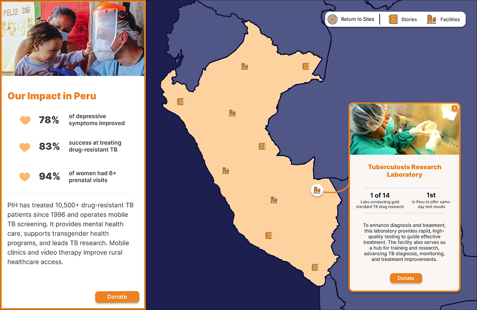
Our Solution
Our team designed a zoomable, interactive global impact map that highlights PIH's work in 11 locations around the world. Features include:
-
Key metrics to illustrate tangible impact.
-
Authentic stories from patients, healthcare workers, and communities.
-
Calls to action that encouraged users to learn more or donate.
These features were chosen specifically to humanize the organization's impact and foster a connection with the audience, helping them feel more confident in their contributions.
Prototypes
With budget and scaling in mind, we developed two prototypes for the impact map.
-
-
Easy-to-implement map that can be embeded directly on PIH's site.
-
Linked to Google Sheets for seamless updates to site content.
-
Free with Google Workspace, but limited in interface and user experience.
-
-
-
Visually enhanced map created on Figma that gave our team full design control. Implementable with either ArcGIS or Mapbox, but with a cost.
-
Branded user interface with an enriched user experience, allowing for future CRM integration.
-
Contributing Creatives
This project was a fully collaborative effort, shaped by the strengths, perspectives, and creativity of our entire team. I had the opportunity to work alongside Annia Pavli, Emma Smith, and Chloe Chu, each of whom played a vital role in bringing this experience to life.
For efficiency, we split into two parallel workflows: Chloe and I focused primarily on the stylized Figma impact map, while Annia and Emma concentrated on the Google My Maps implementation. Within the Figma stream, Chloe and I also explored two different design directions for the supporting pages beyond the main map screen. We ultimately went forward with Chloe’s approach for the final prototype; however, the visuals included in this portfolio showcase the alternative design direction I created.
Even with this division of tasks, every major decision was made collaboratively. We shared progress frequently, exchanged feedback, and ensured that both prototypes aligned with PIH’s mission and our collective vision. The final outcome truly reflects the combined efforts of all four of us.


Impact
Throughout this project, our team honed our skills in empathy-driven design, storytelling, and resource-conscious implementation. The most rewarding outcome was seeing our prototype directly inspire PIHC to add a global impact map on their site!
